The world's experts named their top risks. We measured which ones are firing right now.
Once a year the World Economic Forum asks roughly 900 experts what they fear most, and publishes the answers as the Global Risks Report. It is the field's reference map of what could go wrong. Vigilo does the opposite job: it measures, continuously and from named sources, which of those risks are actually firing — and where. Here is the WEF taxonomy mapped onto a live engine.
Two different instruments
The WEF report is a perception survey with foresight: it captures what a large expert panel believes are the most severe risks over the next two and ten years, sorted into five categories — economic, environmental, geopolitical, societal and technological. It is deliberately forward-looking, and it is published once a year. For its 2025 edition, the panel ranked state-based armed conflict as the most pressing near-term risk, with extreme weather and geoeconomic confrontation close behind. (WEF, Global Risks Report 2025)
Vigilo is a live measurement engine. It does not poll anyone. It reads 44 public, verifiable feeds — WHO, ECDC, CDC, GDACS, GDELT, IODA and 38 more — and turns them into a source-traceable composite risk score (0–5) for every country, refreshed continuously. Where the WEF tells you what experts expect, Vigilo tells you what the data shows today, and lets you click straight through to the underlying source.
The WEF taxonomy, mapped to live coverage
We took a representative slice of the WEF's risk list and asked a simple, honest question for each: can Vigilo measure this in real time from named sources? Green means yes — it is in the live engine today. Amber means partial — we capture a proxy or a slice of it. Grey means no — it is a real risk, but not one a live feed can observe.
| WEF risk | Category | Live on Vigilo |
|---|---|---|
| State-based armed conflict | Geopolitical | ✓Live · Conflict |
| Extreme weather events | Environmental | ✓Live · Climate |
| Infectious diseases | Societal | ✓Live · Health |
| Critical infrastructure disruption | Technological | ✓Live · Infra/Transport |
| Involuntary migration / displacement | Societal | ~Partial · Border |
| Societal polarisation & unrest | Societal | ~Partial · Civil unrest |
| Geoeconomic confrontation | Geopolitical | ~Partial · borders/sanctions |
| Cyber & internet disruption | Technological | ~Partial · outages (IODA) |
| Misinformation & disinformation | Societal | –Not measured |
| Inflation & economic downturn | Economic | –Not measured |
| Biodiversity loss / Earth-system change | Environmental | –Long-horizon |
The pattern is clean. Vigilo covers the physical, fast-moving risks end-to-end — conflict, extreme weather, disease, infrastructure — and partially captures the risks that have a physical footprint, like displacement showing up as border pressure or cyberattacks showing up as internet outages. It deliberately does not claim to measure the slow, perception-driven risks the WEF is built to surface: economic cycles, disinformation, the decade-scale climate transition. We would rather show the gap than fake the coverage.
What the feeds see this week
Here is the live picture as of 24 May 2026 — the ten highest-composite countries, coloured by risk band. Note the top of the table: it is almost entirely conflict, the exact risk the WEF panel ranked #1 for 2025. The survey and the sensor agree.
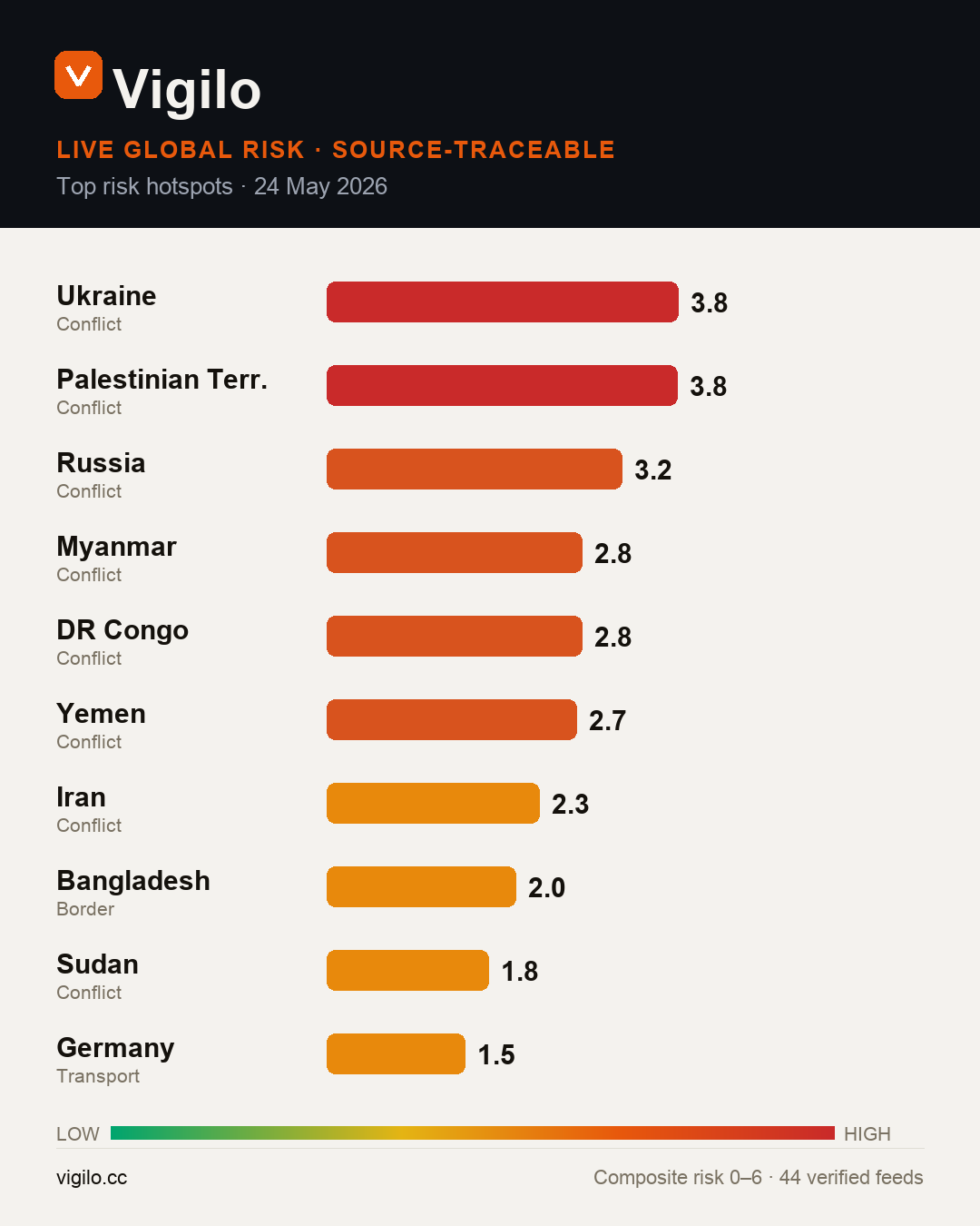
The convergence matters. When an annual expert survey and a continuously-updated measurement engine point at the same risk from opposite directions — perception and observation — that is the strongest signal you can get that it is real and current. Conflict is not a forecast right now; it is the measured top of the table.
Where they diverge — and why that's the point
The grey rows are not failures; they are the honest edge of what live data can do. A feed can tell you a hospital lost power or a flood crested a levee. It cannot, in real time and from a single named source, tell you that an economy is six months from a downturn or that a disinformation campaign is reshaping an election. Those are exactly the risks a foresight survey exists to flag.
So use both. Read the WEF report once a year to set the strategic map. Watch a live engine the rest of the year to know which corner of that map is on fire today — with every number traceable back to its source.
How Vigilo scores risk
Every composite is built from public, verifiable feeds and traces back to its sources — no black box, no single-source claims.
Domains: health, conflict, civil unrest, climate, infrastructure, transport, border. Sources include WHO, ECDC, CDC, GDACS, GDELT, IODA and 38 more — refreshed continuously. Read the full methodology →
See the risks the survey can't update
The WEF report lands once a year. The world doesn't. Open the live globe, save the countries that matter to you, and get an email the moment a new critical signal appears.
This analysis references the World Economic Forum's Global Risks Report 2025 for its risk taxonomy and headline findings; Vigilo is not affiliated with or endorsed by the World Economic Forum, and the report's full rankings, charts and data remain the WEF's own work — see weforum.org. Vigilo aggregates publicly available reporting and structural indicators into transparent, source-traceable risk scores. Scores describe measured signal density and structural fragility — they are decision-support, not guarantees, and should not be the sole basis for safety, travel or operational decisions. Country labels follow source-feed conventions and imply no political position. Figures reflect the data snapshot of 24 May 2026 and change as feeds update.